Keep Reading
If you enjoyed the post you just read, we have more to say!
react
Allie Dyer Bluemel
Last updated on
There’s actually not a lot of code needed to build a styled notification component. But one does not simply build a notification component.

There are levels of complexity (and design) to take into consideration. Once the component is built, there’s inevitably more coding involved once it’s up and running.
When building a notification component, you need to think ahead to what that might mean as the product grows or as new notification features are requested. For this article, we’re focusing on the front-end implementation of notifications.
If you browse around sandboxes like CodePen and CodeSandbox, you’ll find plenty of examples of notifications. These examples usually consist of a few hundred lines of JavaScript or less and a little CSS. These notification sandboxes are usually completely custom builds, or often they are the implementation of a toast library.
While toast libraries can be very useful as a quick implementation that can scale, they are limited to basic notification styles that fall under one of the notification categories: Info, Success, Warning, or Error.

Whether you decide to start with a toast-like library that allows for complete customization or you roll your own solution, custom builds can be hard to scale. A custom solution needs to be reusable, allowing for various content and copy, as well as configured for multiple devices and browsers.
Let’s look at the official example of a React Portal implementation for use as a custom notification component. This gives us a basic modal component that’s triggered by user interaction and has the potential to be completely customized. React Portals are an appealing implementation of in-app notification rendering because they allow children to render outside the parent component to a different location in the DOM.
(We know this code is a little wonky and can use some refactoring — but it’s in the official React docs so 🤷♀️)
const appRoot = document.getElementById('app-root');
const modalRoot = document.getElementById('modal-root');

class Modal extends React.Component {
 constructor(props) {
   super(props);
   this.el = document.createElement('div');
 }

 componentDidMount() {
   modalRoot.appendChild(this.el);
 }

 componentWillUnmount() {
   modalRoot.removeChild(this.el);
 }


 render() {
 // Use a portal to render the children into the element
   return ReactDOM.createPortal(
     this.props.children,
     this.el,
   );
 }
}

class App extends React.Component {
 constructor(props) {
   super(props);
   this.state = {showModal: false};

   this.handleShow = this.handleShow.bind(this);
   this.handleHide = this.handleHide.bind(this);
 }

 handleShow() {
   this.setState({showModal: true});
 }

 handleHide() {
   this.setState({showModal: false});
 }

 render() {
   const modal = this.state.showModal ? (
     <Modal>
       <div className="modal">
         <div>
           With a portal, we can render content into a different
           part of the DOM, as if it were any other React child.
         </div>
         This is being rendered inside the #modal-container div.
         <button onClick={this.handleHide}>Hide modal</button>
       </div>
     </Modal>
   ) : null;

   return (
     <div className="app">
       This div has overflow: hidden.
       <button onClick={this.handleShow}>Show modal</button>
       {modal}
     </div>
   );
 }
}

ReactDOM.render(<App />, appRoot);
If your needs are singular, like one notification to rule them all, this is a practical way to integrate things like tooltips into your product. However, if your expectation is a scaling and ever-changing notification system, there would be quite a lot of work needed to customize this implementation for various use cases and user patterns.
Third-party notification services are a more attractive option when you consider these scaling needs.
Check out the full Portal example on CodePen.
Once a basic notification component is set up, it needs to be styled, and additional functionality needs to be built. Once again, we’ll focus on in-app notifications since they allow for complete customization.
But before we dive in, it’s worth mentioning that push notifications can be customized beyond the default user interface through the implementation of rich push or by building an expandable notification with a full interface.
In contrast, to push notifications, the in-app notifications life cycle is contained within the product itself, so they have the ability to be completely customized.
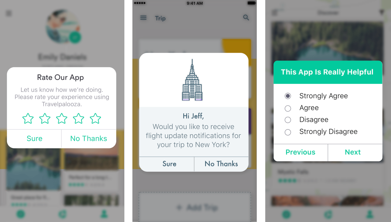
We have three distinct notification requests in the examples above—a rating request, a permissions request, and a survey.
The level of complexity of building each of these can differ depending on the task. A rating request may bring the user to the app store to leave a review, but it could also go to an internal system collecting that data. A survey built into a notification would require integrating forms, an already complex build.
This custom notification component by Paulo Navarro includes a way to send six notification types, with additional options for mode (confirmation, alerts) and size (small, medium, large).
This is a good starting point for designing your own reusable component, but designs might require building in rich media to enhance the user experience. In-app and rich push notifications can both send videos, images, and audio clips along with messaging. You can take an already existing customized notification component like the one above and tailor it to your needs by building in rich media elements.
And even more complex solutions can arise, like the need to integrate forms. Forms inside an in-app notification component can become complex very quickly with user interaction and data from radio buttons, checkboxes, or text inputs. While these types of notifications might be a one-off user interaction, they should still be considered if you’re planning to build out custom, reusable notification components.
The reality is the work doesn’t just end with the visible notification component. Personalized content, collection of user data, tracking requests, and security might need to be a part of the full solution. Let’s take a look at some of the considerations beyond the basic UI and functionality of a notification component.
Building out a custom notification component can be a time suck. MagicBell can get you up and running with notifications in less than an hour. Get an API key instantly and plug in the quick start code from the React SDK to see how easy it is to integrate MagicBell.
With the React SDK, you have both default options as well as the ability to build a fully customizable interface for your notifications.
import React from 'react';
import ReactDOM from 'react-dom';
import MagicBell, { FloatingNotificationInbox } from '@magicbell/magicbell-react';

ReactDOM.render(
 <MagicBell apiKey={MAGICBELL_API_KEY} userEmail="john@example.com">
   {(props) => <FloatingNotificationInbox height={300} {...props} />}
 </MagicBell>,
 document.body,
);
Fifty-two customization options allow you to set up notifications with your brand identity quickly and easily, leaving you more time to focus on the nuances your notification needs.

To get up and running with a notification solution, check out MagicBell today.
Related articles: