It's always risky to tinker with an interface your customers are used to. So why create a new dashboard?
Over the last few years, we've gotten to know our customers better. A lot of that comes from working hand-in-hand with them when they need it. After seeing the types of problems they solve with our dashboard, we decided to turn those ideas into improved end-to-end workflows.
The driving force behind our redesign stemmed from three critical areas: creating a cohesive visual identity, enhancing user experience, and accelerating delivery times. With those goals in mind, we bring you five new benefits you'll love:
Consistency. Our previous dashboard no longer fit with our new visual identity, and we wanted a design that was consistent with our rebrand. We also wanted to support a more self-guided user interface—regardless of whether the user was a developer, a customer support specialist, or a product manager.
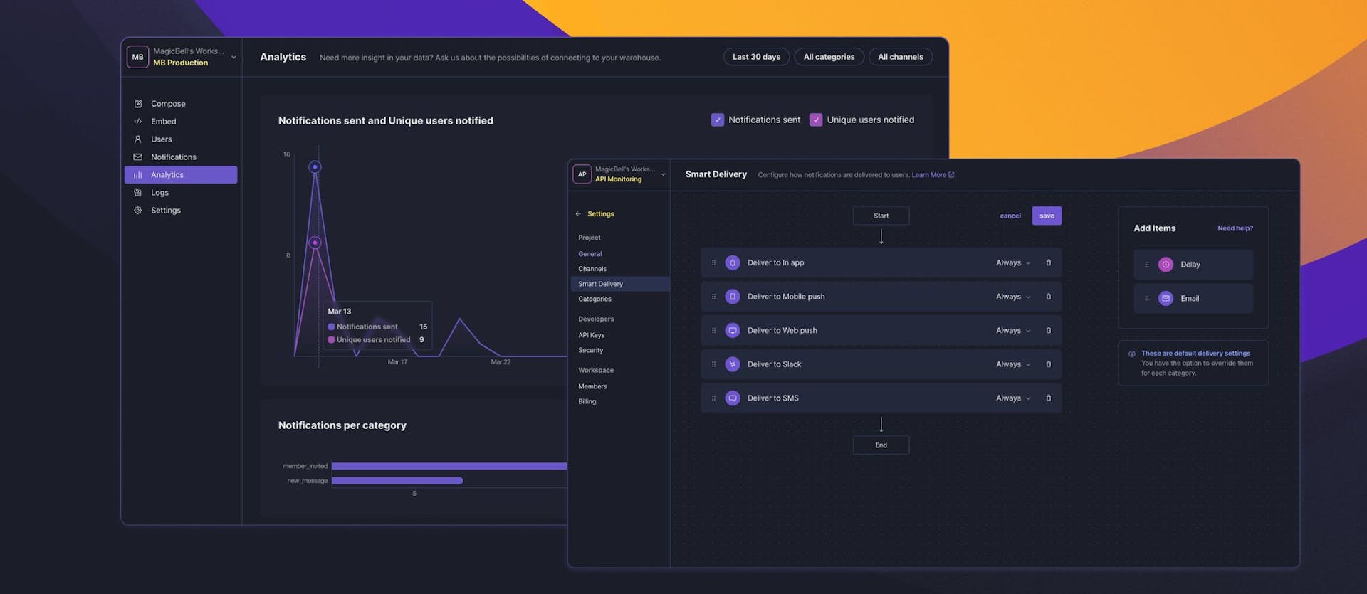
More flexibility. The original dashboard was built in MagicBell's early days and had become like a patchwork quilt with unique code sprinkled throughout. That made it hard to iterate quickly. A core philosophy at MagicBell has always been to avoid sending unnecessary notifications that overburden users. Now, once you got an in-app web push and email all set to deliver, you can do so via the least intrusive channel. And as a fallback, you can send it via web push and email through a new channel.
Speed. Before this redesign, the dashboard was slowing people down. Bulky lists, like the notifications list, could take more than five seconds to load. With these changes, notifications and user data load almost instantly.
Collaboration. Our mission was clear: redesign the dashboard to be a versatile tool that works great for both technical and non-technical users. Today, it's easier to set up and test notifications for more users, not just developers. Don't worry, developer, we still showed you some love: if you're debugging a notification or testing it out, you can now see recipient rules and overrides. This makes it easier to understand whether or not your notifications are working as expected.
Visibility. See more, know more! You can now view all your data while setting up delivery sequences for given categories or while testing notifications. That data includes the enabled channels for a particular category, whether or not it's in the user preferences panel, and what that label is. All your critical data is in immediate view. Increased visibility extends to analytics—we added notifications per category so you can see how each is performing.
Walkthrough: Setting Up Categories
In the early project stages, setting up notification categories is a critical task. With the revamped dashboard, we prioritized efficiency and usability so you can find data effortlessly.
The Categories View provides a comprehensive view of vital data, eliminating the need for excessive clicks. You can easily discern which channels are part of the delivery flow, incorporated into the user's preferences, and the affiliated labels.
We evolved the Notification Details View to suit various use cases. For developers, the ability to view the payload and understand the reason behind a notification. Meanwhile, other team members can swiftly access details like the status, channels, and deliveries linked with a notification.
We've been adding new features over the last few weeks, including push subscription details and telephone numbers. There's more to come—keep an eye out for event updates and easy access to other useful data.
We'd love to hear your feedback and collaborate with you as we add further sophistication to this dashboard. In the meantime, watch our new dashboard demo.
Keep Reading
If you enjoyed the post you just read, we have more to say!