Keep Reading
If you enjoyed the post you just read, we have more to say!
Hana Mohan
Last updated on
We bring you an important notification…about our notifications
This is a guest post by Milena Milak
MagicBell has always been about new beginnings—it sounds redundant, but it's not. The company was the second child of founder Hana Mohan, who wanted to start something new. And I began as a tattoo artist and children's book illustrator who chose to start a new journey as MagicBells' first designer.
So, we love new beginnings, but only when they're fitting. And given MagicBell's growth over the last few years, we felt it was time to evolve our brand identity. If you want to read my take on why investing in the brand identity is worth a short click here.
Since the very beginning, our core principle has been to know your user (following closely behind make their work lives infinitely better). After all, the idea for MagicBell came out of understanding the pains and inefficiency of email-based notifications.
The rebranding of MagicBell took us on a journey to grasp the essence of our users. In this exploration, we discovered that a significant portion of our user community comprises tech-savvy early adopters, including engineers and product owners.
We came to realize that building a notification system is akin to a team sport, where different players must collaborate seamlessly. It's a collective effort that brings together developers, product owners, and other key stakeholders, combining their skills and expertise to create something exceptional.
Understanding our users' preferences, we observed that many developer community members often embrace dark mode as their preferred choice. Taking this into account, we wanted to ensure that MagicBell's rebranding encompassed familiarity, accessibility, and an enjoyable experience for all.
Our ultimate aim was to create a brand that not only fulfils the need for usefulness and usability but also adds an element of fun and enjoyment to the user experience. We wanted MagicBell to be a product that users genuinely enjoy using.
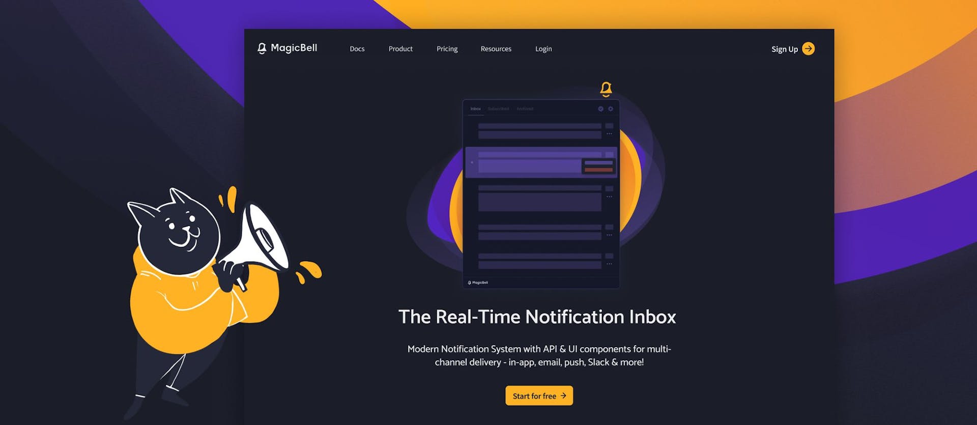
Early on in the design process, we were sold on the dark theme but wanted to maintain the playful and friendly vibe of MagicBell's previous brand.


To achieve this, I balanced the dark background with the same vibrant colors that made up the originalcolourBell color palette. We wanted to pay homage to our whimsical roots while moving confidently into the next era of our brand. And voila, we finalized our new look, Dark Magic.


We use Dark Magic as a design system that works our Dashboard and website. This helps us maintain a consistent look and while also allowing using certain component on our website. It's a win-win situation! By implementing Dark Magic, we ensure that our users have a unified and familiar experience no matter where they interact with MagicBell. Additionally, it helps us work more efficiently by using the same design elements across different platforms. In simpler terms, Dark Magic makes things easier for us by keeping everything consistent and reusable.
While we have chosen to update our previous website using Dark Magic components and new brand guidelines, we are thrilled to announce that we have undertaken a project to build an entirely new website from the ground up. Although it is still a work in progress, we are excited to promise improved performance and a plethora of sleek-looking transitions. We can't wait to share the final results with you.
Meanwhile, we are thrilled to announce that the rebranding process for MagicBell has been successfully completed. And we've got a bonus for you: we made our Dark Magic design system open-source and available on GitHub. We believe in the power of collaboration and consider this part of our contribution to the developer community. If you give it a try, we welcome feedback!
Next up: new website launch. But for the most part, the effort around this new beginning has finally come to an end. We love our new look—and hope you do, too.
Want more reinvention? Want more reinvention? Here’s what’s better about our dashboard.