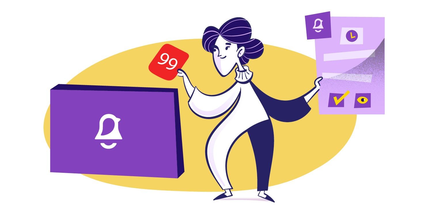
You put a lot of thought and hard work into your app’s user experience (UX), but in-app notification design is just as important. It’s a critical part of your UX that, if done well, can help make your app more successful. Done poorly, it can undermine the work you put into the rest of your app.
So, it’s crucial to give in-app notifications their proper attention and design them well. To help you, we’ve compiled some best practices you can use to design effective, engaging in-app notifications.
In-app notification design: Before you begin
Designing your in-app notifications is like creating anything else. A little planning and thinking ahead goes a long way toward designing them right the first time. That way, you’re less likely to have to scrap them and start over because they aren’t effective or alienate your users.
So, before you begin putting together your in-app notification design, ask yourself these important questions.
What does your app do?
The first thing you need to think about is what your app is designed to do. What problem is it solving for users, and how will it make their lives easier or better?
As you’re developing your notifications, you should always keep that in mind—ask yourself whether the notifications help or hinder your user’s journey. Interrupting users with notifications too frequently or during key processes will only frustrate them and may ultimately lead them to abandon the app.
Also, we recommend that you use notifications judiciously to minimize interruptions and disruptions. There are few things more annoying than trying to perform a task and having to constantly close notifications to do it. To that end, you should also make it easy for users to personalize their notification preferences.
What do your notifications need to do?
The second step is to think about what you want the notifications to accomplish. What are your goals in notifying users, and what should they achieve?
Notifications can serve many different purposes. They can guide users through onboarding or other tricky procedures. They can recommend an action, like upgrading to a paid plan. Notifications also help users get the most out of the app by highlighting features or announcing promotions.
Determining the purpose of the notification will create a good foundation as you move into the design phase.
General design best practices apply to in-app notifications too
In-app notification design is a deceptively nuanced endeavor. Every situation will be different, and notifications are used to meet specific needs for specific users in specific situations.
Those specifics are going to dictate how you should approach designing your in-app notifications. However, there are some general tips and best practices you can use to make sure you’re designing your notifications to be as effective as possible.
Notification styles
Not all notifications have to look and function the same. There are several different notification styles or types you can use in different situations. Some of the most common styles include:
- Tooltips are subtle, simple notes that highlight features and functions of an app. These can help inform new users about important features or give them some assistance when they get stuck. Tooltips are great for onboarding.
- Modals can make a big impact on users. They are best used when you need to get users’ attention, like when you’re making a big announcement of some kind. They are by nature disruptive, so it’s important to think about where and how often you use them.
- Slideouts are more subtle than modals, and are great for communicating more routine information. Typically best in desktop applications, they can also drive more complex user actions, like entering information or gathering feedback.
- Notes are similar to modals, but less urgent. They are typically used to update users on enhancements or new features, and are best used when people begin a user session so as not to unnecessarily interrupt a task.
- Chatbots are automated user assistance notifications, which offer to answer common questions or address problems. While these can be very helpful to users, they can sometimes lead users to a dead end. You can avoid this by connecting the chatbots to a customer service team to help users with specific needs.
Principles of good in-app notification design
Once you know which in-app notification design style is best, you should consider the look and feel of the notification.
This may sound obvious, but notifications should be visually appealing. It might be tempting to treat them as an afterthought, but your designers should treat them with the same attention as they would any other aspect of your app.
Some ways to make notifications pleasing to the eye include:
- A simple, uncluttered design with minimal text
- A clear text hierarchy for fast, easy reading
- An eye-catching image to increase impact
- A clear button, form fields, or other call-to-action
Also, remember that your app reflects your brand. Maybe your app is your brand. In-app notification design is no different. Brand consistency is critical. If your notifications visually conflict with your app’s look and feel, it could undermine your brand.
Well-designed notifications reinforce and strengthen it by reflecting the look and feel of your app. Some best practices include:
- Use the same or complementary color palette and typeface.
- Ensure the tone of the text is consistent with the rest of the app.
- Don’t disrupt users or make them jump through unnecessary hoops to complete tasks.
Color
One of the most important design considerations is color. It plays a critical role in your app, your UX, and your brand. And it’s just as important in your notifications.
Humans associate colors with different emotions. Red can mean excitement or warning. Blue is associated with optimism and loyalty. Purple connotes power and elegance.
When using color, be aware of the symbolism it holds, and consider if it makes sense in the context of your app, notification, and brand. Also, consider cultural differences in how color is perceived around the world. If your app is used in multiple countries, certain colors could send the wrong message.
Urgency and Attention
Another critical consideration for in-app notification design is the urgency of the message and the corresponding level of attention you want users to give. Not every notification is a need-to-know-now message, and your design should reflect how important it is.
Generally, a notification’s urgency will fall into one of three levels: high, medium, and low.
- High-urgency notifications contain information users need to know right now, and may require immediate action. Think of errors, alerts, and confirmations.
- Medium-urgency notifications are also important but don’t require immediate attention or action. These might include cautionary messages, acknowledgment of feedback, or giving users hints about tasks or actions.
- Low-urgency notifications are nice-to-know messages. They keep users engaged, but are usually not meant to drive interaction or action. These could be status updates, accomplishment badges, or unread messages.
Icons are a useful design element for communicating urgency. Icons like the hazard symbol, envelope, and thumbs-up are almost universally understood and help you instantly get your message across, sometimes without words.
In-app notification design and accessibility
People with disabilities have long been overlooked in society. While that is changing as it relates to the physical environment, technology unfortunately can lag in addressing the needs of people with disabilities.
With 1 billion people in the world living with disabilities, it’s important that your in-app notification design accommodates the different needs your users might have.
Start by keeping visibility in mind to accommodate users with impaired eyesight. Smart use of color contrast and text size helps make messages, buttons, and form fields clear and easy to see. However, don’t rely on color contrast alone, as some users can’t perceive all color differences.
Keep in mind also that many users might be using screen readers to help them use the app. To accommodate those people, be sure to use alt text for visual content, live instead of flattened text, and have a clear text hierarchy that screen readers can convey to the user.
Also, be aware notifications that employ too much flashing or flickering can cause seizures.
Accessible design can be complicated, but help is available. Your design team use resources like Google and usability.gov for help in designing in-app notifications to be as inclusive and user-friendly as possible.
Remember: You’re designing for people
At its core, design is about providing solutions to people’s problems. This is true whether it’s a car, a backpack, an app, or even the notifications within an app. Think about your users, who they are, where they are, and how they use your app.
At worst, poorly designed notifications can create frustrated, annoyed users. At best, they are seamless and engaging. Our fully customizable React SDK allows your developers to create an in-app notification inbox for effective and engaging notifications.
To schedule a demo of our embeddable notification inbox, contact us.