
A toast notification is a small, temporary message that appears on screen to give users brief feedback about an action without interrupting their workflow. Toast notifications auto-dismiss after a few seconds, take up minimal screen space, and require no user interaction — making them ideal for confirmations, status updates, and non-critical alerts in web and mobile applications.
How Toast Notifications Work
A toast notification appears when a user completes an action — sending an email, saving a file, or deleting a record. The notification slides into view at the bottom or top of the screen, displays a short message for 2-6 seconds, and disappears on its own.
Toast notifications share a few core traits:
- They display one or two lines of text.
- They auto-dismiss after a set duration.
- They overlay the existing UI without blocking interaction.
- They do not play sounds or appear in notification centers.
- They optionally include one action button (like "Undo") and a close button.
Developers can customize placement, duration, and styling, but changing too many defaults turns a toast into a banner or dialog — a different UI pattern with different expectations.
Toast Notification Examples
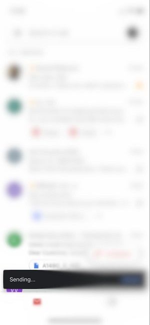
Gmail: "Message sent"
When you send an email in Gmail, a toast notification appears at the bottom of the screen saying "Message sent." The user can keep working without acknowledging it.
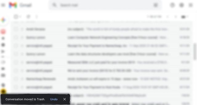
Gmail: "Conversation moved to Trash" with Undo
When you delete an email, Gmail shows a toast with the text "Conversation moved to Trash" and an Undo button. This gives the user a brief window to reverse the action. If ignored, the toast disappears and the deletion stands.
Common use cases
- Success confirmations: "Settings saved," "Profile updated," "Item added to cart."
- Status updates: "Syncing..." "Upload complete."
- Error feedback: "Failed to save. Try again."
- Undo actions: "Message archived" with an Undo button.
Toast Notification vs Snackbar vs Alert
Toast notifications are often confused with snackbars and alerts. Each serves a different purpose.
| Feature | Toast Notification | Snackbar | Alert / Dialog |
|---|---|---|---|
| Duration | Auto-dismisses (2-6s) | Auto-dismisses or persists | Persists until dismissed |
| User action required | No | Optional (one action button) | Yes (confirm/cancel) |
| Blocks interaction | No | No | Yes |
| Placement | Bottom or top of screen | Bottom of screen | Center of screen |
| Use case | Confirmations, status | Undo, retry, brief actions | Critical decisions, errors |
When to use each:
- Use a toast notification for simple confirmations that need no response: "Copied to clipboard."
- Use a snackbar when the user might want to act: "Email archived. Undo."
- Use an alert for critical decisions that require confirmation: "Delete this project? This cannot be undone."
Material Design introduced the snackbar as an evolution of the toast. In practice, many apps use the terms interchangeably, but the distinction matters when designing notification UX.
How to Implement Toast Notifications
Android (Kotlin and Java)
Toast notifications originated on Android. The Toast.makeText() method creates a toast, and show() displays it.
Kotlin:
val toast = Toast.makeText(applicationContext, "Settings saved", Toast.LENGTH_SHORT)
toast.show()
Java:
Toast toast = Toast.makeText(getApplicationContext(), "Settings saved", Toast.LENGTH_SHORT);
toast.show();
Or as a one-liner:
Toast.makeText(context, "Settings saved", Toast.LENGTH_SHORT).show()
Toast.LENGTH_SHORT displays for about 2 seconds. Toast.LENGTH_LONG displays for about 3.5 seconds.
React Native
React Native provides the ToastAndroid module for Android. For cross-platform toast notifications that work on both Android and iOS, see our guide to React Native toast notifications.
import { ToastAndroid } from 'react-native';

ToastAndroid.show('Settings saved', ToastAndroid.SHORT);
For position control, use showWithGravity():
ToastAndroid.showWithGravity(
  'Settings saved',
  ToastAndroid.SHORT,
  ToastAndroid.CENTER,
);
React (Web)
For React web applications, libraries like react-toastify and react-hot-toast provide toast notification components. See our React toast notifications tutorial for implementation details.
Accessibility Best Practices
Toast notifications can be invisible to users who rely on screen readers or need more time to read. Follow these practices to keep them accessible.
Use ARIA live regions. Set role="status" and aria-live="polite" on your toast container so screen readers announce new messages without interrupting the current task.
Ensure sufficient contrast. Toast text should meet WCAG 2.1 AA contrast requirements (4.5:1 ratio for normal text). Avoid light text on light backgrounds.
Allow enough reading time. A minimum of 5 seconds gives most users time to read the message. For longer messages, increase the duration or let users dismiss manually.
Avoid stacking too many toasts. Multiple simultaneous toasts overwhelm users and make it hard to process information. Queue them or show only the most recent one.
Do not put critical information in toasts. Toasts disappear. If the user must see and act on the information, use a snackbar with an action button or an alert dialog instead.
Toast Notification Design Tips
Keep messages short. One line is ideal. Two lines maximum. If you need more text, it should not be a toast.
Position consistently. Pick a location — bottom center is the most common — and stick with it across your app. Users learn to expect toasts in a specific spot.
Use icons sparingly. A green checkmark for success or a red circle for errors adds clarity. Avoid decorative icons that don't convey meaning.
Match your design system. Toast styling should feel like part of your app, not a browser default. Match colors, typography, and border radius to your existing components.
Do not use toasts for marketing. Toasts are for system feedback, not promotional messages. Using them for ads or upsells erodes user trust.
Frequently Asked Questions
What is a toast notification?
A toast notification is a brief, auto-dismissing message that appears on screen to confirm an action or provide a status update. It does not require user interaction and disappears after a few seconds. The name comes from the way the message "pops up" like toast from a toaster.
What is the difference between a toast and a snackbar?
A toast is passive — it appears and disappears with no user interaction. A snackbar can include an action button (like "Undo" or "Retry") and may persist until the user acts or dismisses it. Material Design treats them as separate components, though many apps use the terms interchangeably.
How long should a toast notification last?
Between 2 and 6 seconds. Short confirmations ("Saved") can use 2-3 seconds. Longer messages or messages with an action button should display for 5-6 seconds. For accessibility, err on the longer side.
Are toast notifications accessible?
They can be, with proper implementation. Use ARIA live regions so screen readers announce the message. Ensure sufficient color contrast. Avoid putting critical actions in toasts — if the user must respond, use a snackbar or alert instead.
Can you make toast notifications persist?
Standard toast notifications auto-dismiss by design. If you need a persistent notification, use a snackbar (which can remain until dismissed) or an in-app notification inbox that stores messages for later viewing.
Add a Notification Inbox to Your App with MagicBell
Toast notifications disappear. Once the message is gone, the user cannot retrieve it. If your app needs persistent notifications alongside toasts, MagicBell provides an embeddable notification inbox that captures and stores messages across channels — including Slack, email, push, and in-app. Users can review past notifications at any time.
Get started with MagicBell for free — setup takes less than five minutes.