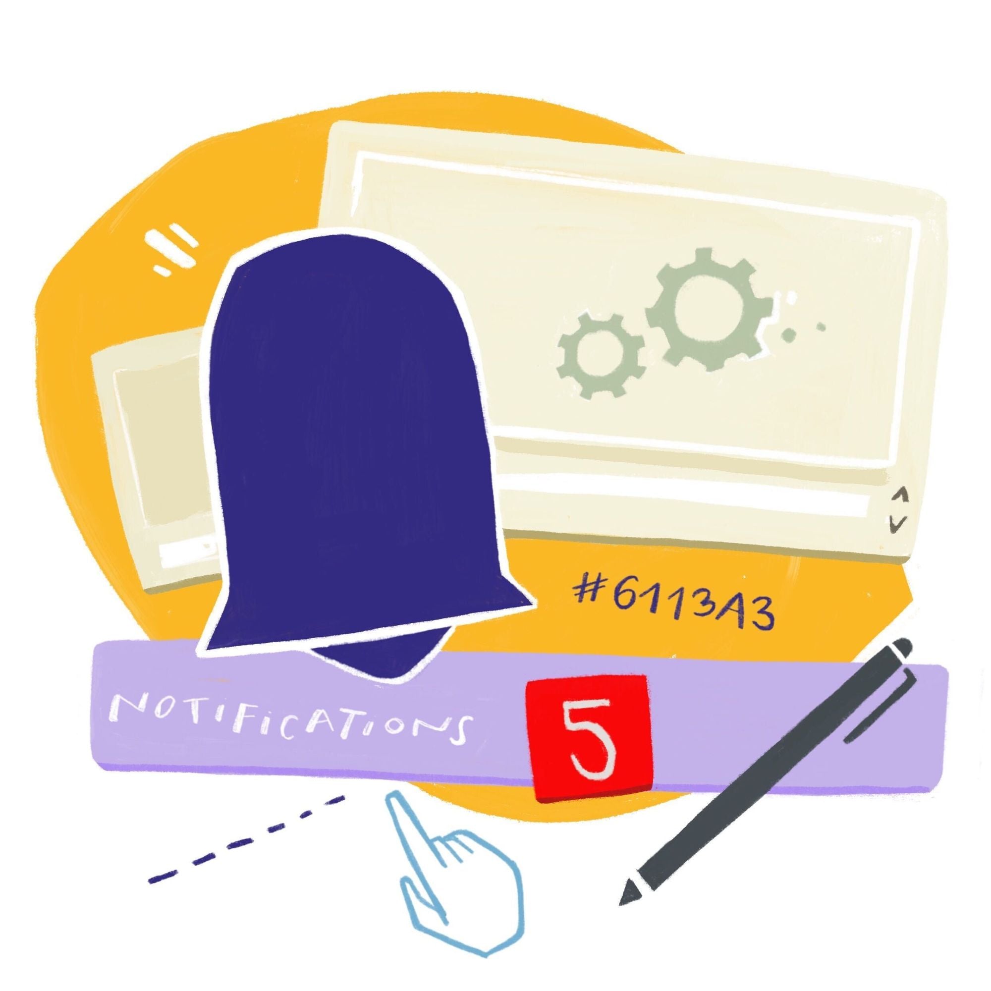
In-app notifications can be, and often are, very distracting. They’re triggered by website logins, abandoned carts, and feature updates. But certain notifications, like when someone needs your attention on a design file, are important and time-sensitive. These notifications need a place to live that’s not intrusive to your workflow.
A notification inbox can be the answer to those management problems. Building a solution in-house is an option, but we want you to be able to focus on building the core features of your product, not spending time building an inbox for all those important notifications.
We make notification customization easy with our MagicBell React SDK and MagicBell Browser/JavaScript Client. (with support for English, Spanish, and Brazilian Portuguese)!
Notification customization with the React SDK
Good design and simplicity can go a long way when dealing with notifications. Notification customization begins with choosing a type of inbox to store notifications on your site or in your app.
Provider is the root component in the SDK initializing a connection to magicbell.io. You can then implement the Inbox or the FloatingInbox.
The Inbox is an infinite scroll list with an accompanying header and footer. It also supports pagination, read/unread states, and customizable rendering of notification items. This would be ideal to use if you wanted to build a separate page or section of your application for users to access notifications.
The FloatingInbox is a tooltip render of the Inbox. This would be ideal to use if you wanted to build users an easy way to access their notifications from any page.
For this demo, we’ll be looking at the FloatingInbox.

Example of FloatingInbox with the React SDK
// App.tsx

<Provider token={USER_JWT}>
    <FloatingInbox
      height={500}
      width={400}
      offset={10}
      InboxComponent={CustomNotification}
    />
</Provider>
This Provider component takes the user JWT token to get the notifications for a user. You can learn about user authentication and how to generate a User JWT on our docs.
The FloatingInbox is a tooltip component that renders notifications. You can set the height, width, InboxComponent and ButtonComponent to customize the floating inbox.
The InboxComponent is rendering a CustomNotification component, which renders the inbox component to render inside the floating panel.
// CustomNotification.tsx

import Inbox from "@magicbell/react/inbox";
import type { Notification } from "magicbell-js/user-client";

export default function CustomNotification() {
  return <Inbox ItemComponent={NotificationItem} />;
}

function NotificationItem(props: { index: number; data: Notification }) {
  return (
    <div
      className="magicbell--inbox-item text-sm flex gap-1"
      data-index={props.index}
      tabIndex={0}
    >
      <UnreadState data={props.data} />
      <div>
        <div className="font-semibold">{props.data.title}</div>
        <span className="text-slate-500">{formatTime(props.data.sentAt)}</span>
        <p className="mt-4">{props.data.content}</p>
      </div>
    </div>
  );
}
A notification item component can be customized based on different states:
readAtseenAt
In this example, the UnreadState component is simply checking if the notification has been read, and if it has not been read, it renders a little blue SVG circle (as seen in the image above).
// CustomNotification.tsx

function UnreadState(props: { data: Notification }) {
  return (
    <div>
      {props.data.readAt ? null : (
        <svg viewBox="0 0 512 512" width="20px">
          <circle cx="256" cy="256" r="64" fill="#586ee0" />
        </svg>
      )}
    </div>
  );
}
You can get data related to a notification that can be used to render an individual notification:
- Title
- Content
- Read At
- Seen At
- Custom Attributes etc
The Notification Model contains a detailed documentation of the data a Notification response returns.
You can play around with the React SDK demo here.
Notification customization with the MagicBell Browser Client
If you want more control over the notifications, you can get started with the MagicBell JS client, which provides various services:
For example, if you want to list all notifications for a user:
import { Client } from 'magicbell-js/user-client';

(async () => {
  const client = new Client({
    token: 'YOUR_TOKEN',
  });

  const { data } = await client.notifications.listNotifications({
    limit: 6,
    startingAfter: 'starting_after',
    endingBefore: 'ending_before',
    status: 'status',
    category: 'category',
    topic: 'topic',
  });

  console.log(data);
})();
You can use the Notifications Service to:
- Lists notifications.
- Archive notifications.
- Marks notifications as read.
- Gets a notification by ID etc.
You can find more information about NotificationsService here.
You can combine methods from different services and use them as you like for further customization.
Notification customization in the browser
The MagicBell React SDK comes with stylesheets that you can import for out of the box styles:
import '@magicbell/react/styles/floating-inbox.css';
If want to tailor the inbox to be on brand, you have complete control over the theme.
Different elements of the Inbox have CSS classes that you can style in your own stylesheet:
- Buttons:
magicbell--button - Inbox:
magicbell--inbox- Inbox Button:
magicbell--inbox-button
- Inbox Button:
- Header:
magicbell--inbox-header- Header Title:
magicbell--inbox-header--title - Header Actions:
magicbell--inbox-header--actions - Header Buttons:
magicbell--inbox-header--button
- Header Title:
- Inbox Item:
magicbell--inbox-item- Item Content:
magicbell--inbox-item--content - Item Date:
magicbell--inbox-item--date - Item Action:
magicbell--inbox-item--action - Item Button:
magicbell--inbox-item--button - Menu Button:
magicbell--inbox-footer
- Item Content:
- Floating Menu:
magicbell--floating-menu - Footer:
magicbell--inbox-footer

Custom dark theme example
You can style the inbox by adding the MagicBell Inbox classes in your stylesheets
Here is an example of a custom dark theme:
body {
  --magicbell-font-family: 'Inter', 'Helvetica Neue', Arial, sans-serif;
}

body .magicbell--button {
  font-size: 14px;
  font-weight: 600;
}

body .magicbell--inbox {
  /* Text colors */
  --magicbell-text-default: #f5f5f5;
  --magicbell-text-muted: #9ca3af;
  --magicbell-text-link: #3b82f6;
  --magicbell-text-link-hover: #60a5fa;

  /* Border & background */
  --magicbell-border-muted: #374151;
  --magicbell-bg-default: #111827;
  --magicbell-bg-hover: #1f2937;
  --magicbell-bg-active: #374151;

  /* Surfaces */
  --magicbell-surface-bg: #1f2937;
  --magicbell-surface-bg-hover: #2d3748;
  --magicbell-surface-bg-active: #374151;
  --magicbell-surface-text: #f9fafb;
  --magicbell-surface-text-hover: #f9fafb;
  --magicbell-surface-text-active: #f9fafb;

  /* Shadows */
  --magicbell-shadow-elevated: 0 0 6px rgba(0, 0, 0, 0.4), 0 5px 12px rgba(0, 0, 0, 0.6);
}

body .magicbell--inbox > :not(.magicbell--inbox-header) {
  scrollbar-gutter: stable;
  scrollbar-color: #4b5563 #1f2937; /* thumb, track */
  scrollbar-width: thin;
  background-color: #111827;
}

body .magicbell--inbox-header {
  display: flex;
  align-items: center;
  justify-content: space-between;
  border: none;
  padding: 12px;
  background: #111827;
}

body .magicbell--inbox-footer {
  padding: 12px;
}

body .magicbell--inbox-item {
  margin: 4px 0 4px 8px;
  padding: 12px;
  width: calc(100% - 20px);
  border: none;
  border-radius: 8px;
  background: #1f2937;
}

body .magicbell--inbox-item--date {
  display: inline;
  color: #9e9e9e;
}

body .magicbell--inbox-item--action {
  position: absolute;
  bottom: 12px;
  right: 12px;
  background: transparent;
}

body .magicbell--inbox-item--action button {
  background: transparent;
  border: none;
}

body .magicbell--inbox-item--content {
  margin-top: 12px;
}

body .magicbell--floating-menu {
  background: #1f2937;
  border: 1px solid #3b82f6;
  border-radius: 12px;
  list-style: none;
}

body .magicbell--floating-menu ::marker {
  content: '';
  display: none;
}

body .magicbell--floating-menu {
  margin: 0;
  padding: 4px;
}

body .magicbell--inbox-footer--logo a {
  color: #fff;
}
Get up and running with a notification inbox
If your application or website can benefit from a notification inbox, sign up with MagicBell and start playing around!