Push notifications are a powerful way to grab attention and keep users engaged. But the icon you choose can make or break that first impression. A well-designed icon not only stands out in a crowded notification bar but also conveys the message instantly. If you want your notifications to pop and feel polished, picking the right icon set is crucial.
Why Icon Sets Matter for Push Notifications
Icons are small, but their impact is huge. When a push notification appears, users often glance at it for just a second or two. The icon acts like a visual shortcut, signaling what the notification is about without needing to read the text. A clear, crisp icon helps users quickly understand the context—whether it’s a new message, an alert, or a reminder. This instant recognition is crucial in a fast-paced digital environment where users are bombarded with information. A well-designed icon can evoke an emotional response, prompting users to engage with the notification immediately rather than dismissing it.
Choosing a cohesive icon set ensures consistency across your app or website. This consistency builds trust and makes your notifications feel like a natural part of the user experience. Plus, using icons that are optimized for different screen sizes and backgrounds prevents them from looking blurry or out of place. When icons are thoughtfully designed, they can also enhance brand identity. For instance, a unique icon style can become synonymous with your brand, making your notifications instantly recognizable amidst a sea of other alerts. Furthermore, incorporating elements of your brand's color palette into the icons can create a harmonious visual experience, reinforcing brand loyalty and recognition.
Moreover, the choice of icons can also influence user behavior. For example, a notification icon that conveys urgency, such as an exclamation mark, can prompt users to act quickly, while a more casual icon might encourage leisurely engagement. This strategic use of iconography not only aids in communication but also enhances the overall effectiveness of your push notifications. By carefully considering the design and meaning behind each icon, developers and marketers can craft a more engaging and intuitive user experience that resonates with their audience.
What to Look for in Push Notification Icon Sets
Not all icon sets are created equal, especially for push notifications. Here are some key qualities to prioritize:
- Clarity: Icons should be simple and recognizable even at small sizes.
- Style: Choose a style that matches your brand-flat, outline, filled, colorful, or monochrome.
- Variety: A good set offers a range of icons covering common notification types.
- Scalability: Icons must look sharp on all devices, including retina displays.
- Licensing: Make sure the icons can be used commercially without legal headaches.
In addition to these essential qualities, consider the emotional impact of your icons. Icons can convey a sense of urgency or importance, and their design can influence user engagement. For instance, a notification icon that uses vibrant colors can evoke excitement, while softer hues may suggest a more relaxed update. This emotional resonance can significantly affect how users perceive and respond to notifications, making it crucial to choose icons that align with the intended message.
Furthermore, think about the context in which your notifications will appear. Icons should not only be visually appealing but also contextually relevant. For example, if your notifications are primarily for a news app, icons representing breaking news or alerts should stand out distinctly from those used for general updates. This contextual differentiation helps users quickly identify the nature of the notification, enhancing their overall experience and interaction with your app.
1. Feather Icons
Feather Icons are a popular choice for push notifications because of their minimalist and clean design. These are open-source, lightweight, and built on a simple stroke-based style that works well on any background.
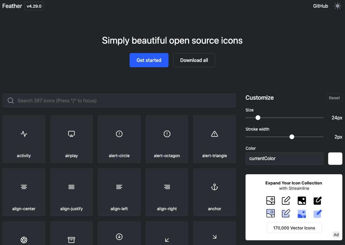 Each icon is designed to be clear at small sizes, which is perfect for notification bars. The set includes common symbols like bell, message, alert, and checkmark, covering most notification needs. Plus, Feather Icons are easy to customize with CSS, letting you tweak stroke width or color to match your app’s theme.
2. Material Icons by Google
Google’s Material Icons are a comprehensive, versatile set that fits perfectly with modern design trends. They offer both filled and outlined versions of every icon, giving you flexibility depending on your notification style.
Because they’re maintained by Google, these icons are updated regularly and optimized for performance. The set includes everything from simple alerts to social media symbols and action icons. Material Icons also come with extensive documentation and support, making integration straightforward.
3. Ionicons
Ionicons is another excellent set tailored for mobile and web apps. It’s known for its sharp, crisp lines and a mix of filled and outline styles. The icons are designed to be pixel-perfect at small sizes, which is essential for push notifications.
The set covers a wide range of categories, including communication, media, and system alerts. Ionicons also supports SVG and web fonts, so you can choose the format that best suits your project. Their open-source nature means you can use them freely in commercial projects.
4. Font Awesome
Font Awesome is one of the most famous icon libraries around, and for good reason. It offers thousands of icons, including many tailored for notifications and alerts. The set includes traditional symbols like bells, exclamation marks, and envelopes, plus more creative options.
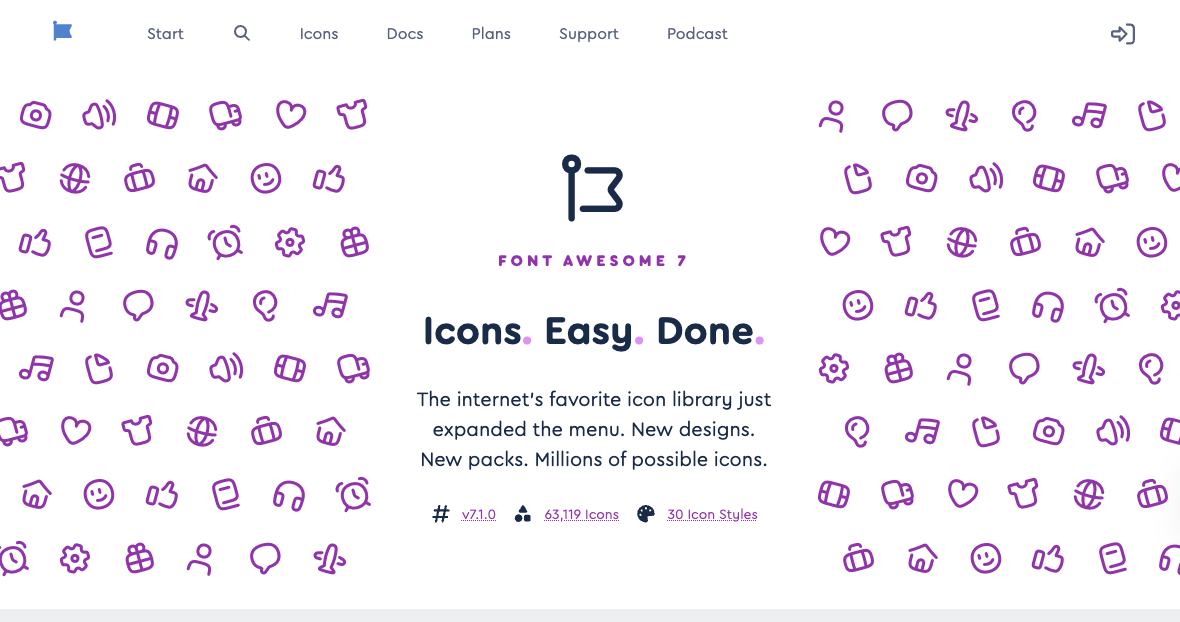 One of the advantages of Font Awesome is its extensive ecosystem. You can easily customize icons with CSS animations or combine them with other design elements. While the free version is robust, the pro version unlocks even more icons and styles if you need them.
5. Heroicons
Heroicons are a set of free, MIT-licensed SVG icons designed by the creators of Tailwind CSS. They feature a simple, modern aesthetic with both outline and solid styles. These icons are optimized for clarity and legibility, making them great for push notifications.
Because they’re SVG-based, Heroicons scale beautifully on any device and can be easily styled with CSS. The set includes common notification symbols like bell, chat, and check-circle, ensuring you have the basics covered without clutter.
6. Line Awesome
Line Awesome is a drop-in replacement for Font Awesome but with a clean, line-based style. It’s perfect if you want a minimalist, modern look for your notifications without sacrificing variety.
The set includes hundreds of icons, many of which are relevant for notifications: alerts, messages, system statuses, and more. Line Awesome icons are available as SVGs and web fonts, allowing for flexible implementation. They’re also free for commercial use, which is a big plus.
7. Octicons
Octicons are GitHub’s official icon set, designed with simplicity and clarity in mind. They’re ideal for tech-related apps or services that want a clean, no-nonsense notification style.
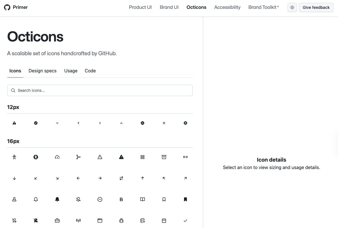 The set includes basic notification icons like bell and alert, as well as symbols for issues, pull requests, and other developer-centric actions. Octicons come in SVG format, ensuring crisp display at any size. Their straightforward design makes them easy to integrate and customize.
8. Zondicons
Zondicons offers a stylish, modern set of SVG icons with a focus on usability and aesthetics. The icons have a balanced look that’s neither too heavy nor too light, making them suitable for a variety of notification types.
The set includes common alert icons, communication symbols, and status indicators. Because they’re SVGs, you can easily change colors and sizes to fit your notification design. Zondicons are free to use under an open license, which makes them accessible for many projects.
9. Streamline Icons
Streamline Icons is a premium icon set known for its extensive collection and detailed design. It offers thousands of icons in multiple styles, including line, solid, and multicolor versions.
For push notifications, Streamline provides highly polished icons that can elevate the look of your alerts. The set covers a wide range of categories, ensuring you’ll find exactly what you need. While it’s a paid option, the quality and variety make it worth considering for professional projects.
10. Iconmonstr
Iconmonstr is a free icon library that offers simple, bold icons perfect for push notifications. The icons are designed to be easily recognizable and work well at small sizes.
The set includes a variety of notification-related icons like bells, messages, and alerts. Iconmonstr icons are available in SVG and PNG formats, making them easy to implement across different platforms. Their straightforward style fits well with both modern and classic UI designs.
Tips for Using Icon Sets in Push Notifications
Choosing a great icon set is just the first step. How you use the icons matters just as much. Here are some pointers to get the most out of your icons:
- Keep it simple: Avoid overly detailed icons that lose clarity at small sizes.
- Match your brand: Use colors and styles consistent with your overall design language.
- Test on devices: Check how icons look on various screen sizes and backgrounds.
- Use SVGs when possible: They scale better and allow for easier customization.
- Don’t overload notifications: One clear icon per notification is usually enough.
Final Thoughts
Push notification icons might be small, but their role is huge. The right icon set can improve readability, boost engagement, and make your alerts feel professional and trustworthy. Whether you prefer open-source options like Feather Icons and Heroicons or premium collections like Streamline Icons, there’s something on this list for every style and budget.
Invest a little time in picking and customizing your icons, and your notifications will thank you with higher click-through rates and happier users.
Enhance Your Notifications with MagicBell
Now that you understand the importance of choosing the right icons for your push notifications, take the next step in elevating your user engagement with MagicBell. As the complete notification inbox solution for your applications, MagicBell seamlessly integrates with your web and mobile platforms, offering a real-time notification system that's both versatile and user-friendly. Ready to enhance your notification strategy? Sign up for free and get started in just 5 minutes with our easy-to-use API and React SDK.